WORLD SPEC
Client: Maruike Syoukou Co., Ltd.
Direction, Logo design, Graphic design: Hironori Inoue
Web direction, Web design: Seiko Makita
Html cording, Programming: Farout Ltd.
Ping pong shop called World spec located in Ikebukuro, Tokyo wanted a help in designing logo, member’s card and web site. They wanted go away from old fashioned ping pong image and bring out something new and cool about ping pong. We have suggested orange as dominant color with gray visual elements.
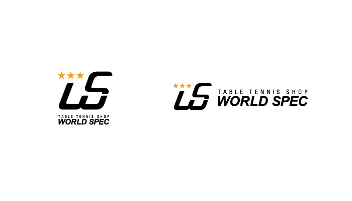
Logo
WORLD SPEC abbreviates to W and S in the logo design. It also is designed with three stars to represent highest class as finest ping pong ball has three stars printed.
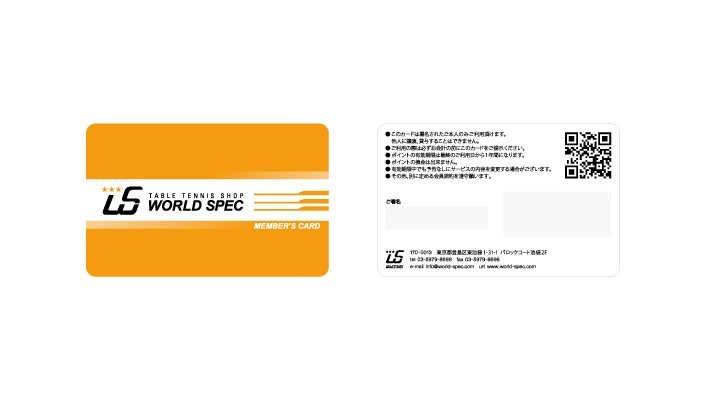
Shop card
Used the logo as main element the shop card shows speed of ping pong with orange gradient.
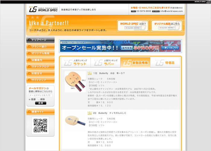
Website: Home page
The web site has two parts. The top part shows their product lines and the lower pages in the three has about the shop and about the brand information. The web site is made in collaboration with programming company for people in the shop to update product lines. Also, we have proposed mobile phone site since main audience will be junior and high school teenagers.
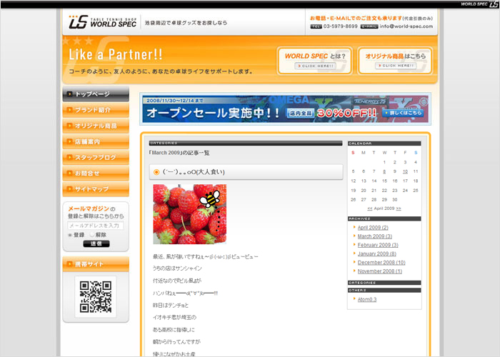
Website: BLOG page
Suggested and built blog page for better communication. It is editable either by PC and mobile phone.