LEONE KIDS DENTAL CLINIC
Client: LEONE KIDS DENTAL CLINIC
Direction, Illustration: Nobumasa Takahashi
Design: Hazuki Sasaki
We designed all items of the infant dental office, LEONE KIDS DENTAL CLINIC.
In the clinic, it was an interior based on yellow.
And, it was very lovely.
So we suggested the design matched the image of them.
And we produced the design that children become happy.
The concept is a design it is simple, cheerful, happy, and with warmth.
Lion's illustration, drawn by artist Nobumasa Takahashi also represented it.
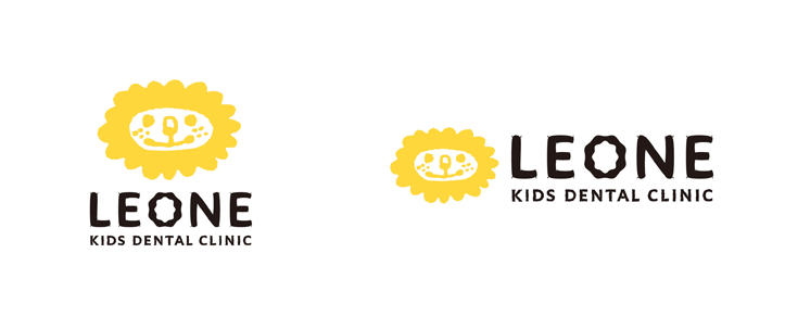
Logo
The clinic's name is " LEONE " KIDS DENTAL CLINIC.
So we suggested that the lion was strongly impressed by using lion's illustration.
It aimed at the impression it was cheerful, and with warmth by using yellow as a brand color.
This yellow matches to the color of the clinic interior.
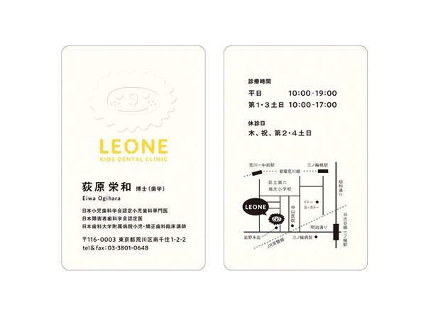
Business card
The business card made of the paper with a little yellow, and worked in embossing finish.
As a result, It made the feeling of soft and warmth.
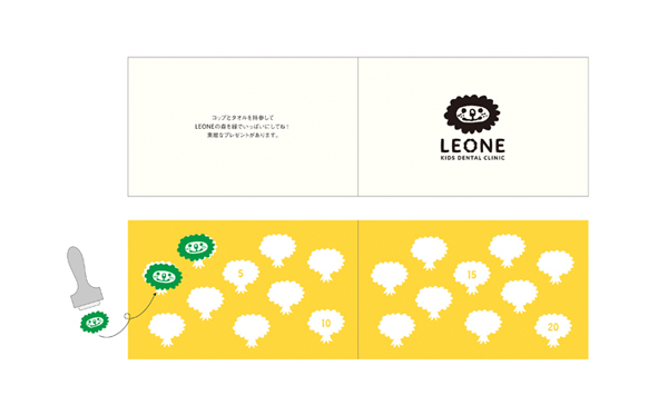
Point card
From the viewpoint of ecology, this clinic is recommending bringing own cup.
So we suggested to make a point card.
Children can affix the stamp of lion with green ink.
The image of the forest will appear if all stamps are affixed.
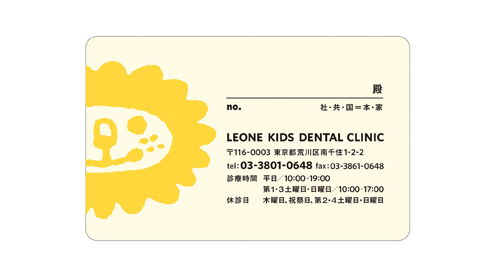
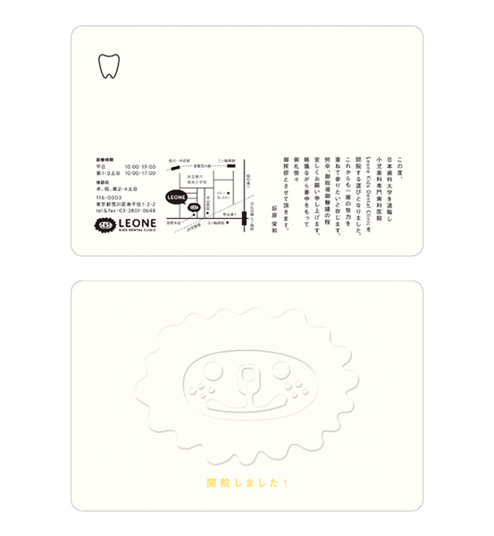
Clinic card
We aimed at a legible design of information.
In addition, The card was made easy to find by making it to cream color (not white) in the purse.
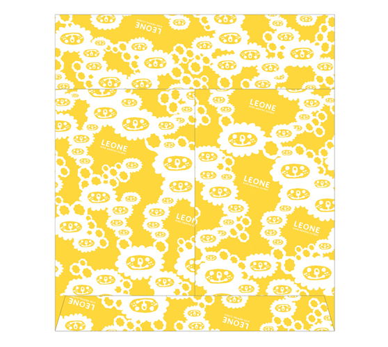
Orijinal bag
It is medicine bag. But there are not so many chances to put the medicine.
So We made the bag from a large size as the toothbrush was suitable, too.
We enjoyed designing the pattern of this bag.
Greeting card
It is the greeting card for the opening of the clinic.
The card stands out because it used the embossing finish.
When the greeting card reaches, you will feel the image of LEONE KIDS DENTAL CLINIC.
Link
LEONE KIDS DENTAL CLINIC
Artist/Illustrator Nobumasa Takahashi